"A thoughtful and well-developed brand concept that showcases creativity, versatility, and strong potential for wider application."
-------- Review from Future Art & Design Award


Winners Gallery displays only a representative image (thumbnail) of each entry.
Project description
The brand founder approaches coffee as a form of artistic creation. Therefore, in the early planning stages, the designer did not focus on simply creating an attractive logo, but instead asked, “How can aroma be seen?” This design deconstructs abstract concepts such as “scent,” “taste,” and “craftsmanship” into a replicable and memorable visual language. Drawing inspiration from the philosophy of “From Seed to Cup,” the designer developed a systematic set of symbols that transform the processes of brewing, roasting, and tasting into visual memory, paving a solid path for the brand’s international identity.
UNIQUE PROPERTIES / PROJECT DESCRIPTION/DIFFERENTIATION
The visual design deconstructs “J.W. ROAST” into a visual lexicon symbolizing the coffee-making process—from tools to actions to aroma. The letter V with three dots captures the moment of beans being poured; the combination of C and an inverted U outlines the angle of a pouring kettle; a W with an inverted triangle below simulates the motion of manual brewing, reflecting the rhythm of water flow and latte art. Stacked S shapes form steam lines, and when merged with the shape of C, they evoke the rising steam of an espresso cup. The designer redefined the alphabet, akin to a barista’s set of tools and gestures, shaping a choreographed sensory experience through daily operations like roasting, grinding, brewing, and extracting.
Returning to the fundamentals of brand creation, the designer treated aroma as a brushstroke to create a totemic symbol for baristas—clean in proportion, dark in tone, and highly professional. The brand is designed to be read in motion and remembered in stillness, standing out with creativity and detail in the competitive coffee scene.
PRODUCTION OR REALIZATION TECHNOLOGY (AND MATERIALS)
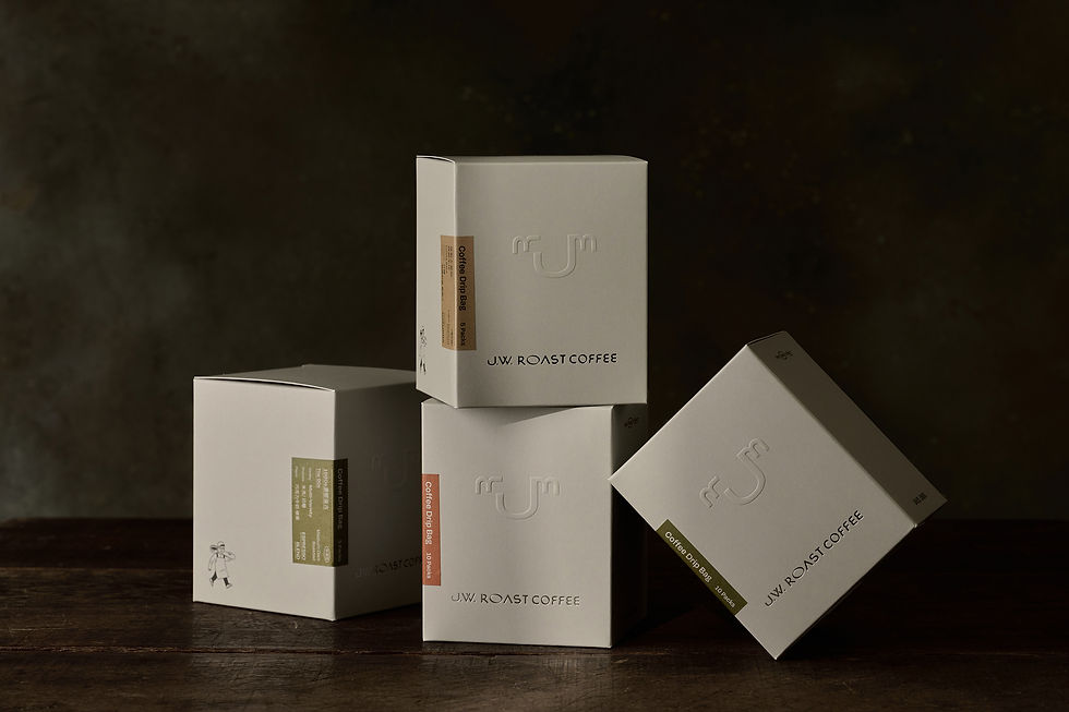
The brand’s primary color is a rich olive-brown (#5b5326), reminiscent of roasted coffee beans, accented by mid-range tones like caramel orange (#9e5330), latte brown (#c88f46), and almond taupe (#9c866b) to create a visual flavor spectrum. The supporting palette includes cool gray (#b5b5b6) and pure black (#000000) to maintain a sense of depth and sophistication. These colors extend across packaging, stationery, apparel, and interior design. Materials such as matte foil stamping, recyclable kraft paper, woven labels, and dyed fabrics convey a sense of texture and warmth, forming a tactile and emotional connection with consumers. The brand leaves a lingering impression not only through taste but also through touch.
SPECIFICATIONS / DIMENSIONS / PACKAGE / TECHNICAL PROPERTIES
This visual identity is applied broadly across a range of materials, including coffee bean bags, bean cards, drip bags, paper bags, metal stickers for equipment, aprons, caps, business cards, and eco tote bags. A key challenge was translating abstract ideas like “aroma” and “craftsmanship” into a structured and recognizable visual system with strong adaptability. The designer achieved this by converting the rituals of daily coffee-making into a symbolic language and resolving the challenges of diverse material applications through multi-layered layouts and spatial proportions—ensuring that each product reflects the brand’s poetic interpretation of aroma, balancing artistry and everyday usability.
OPERATION / FLOW / INTERACTION/FUNCTION
J.W. Roast Coffee regularly participates in domestic and international roasting and latte art competitions. Its visual identity has become a cornerstone of brand recognition. Whether at trade shows or competition venues, the aprons and product packaging immediately signal the brand’s unique character. Both consumers and judges often remark that the brand offers not only great-tasting coffee but also a compelling visual narrative—indicating that the design successfully conveys the barista’s dedication and artistry. Each aromatic cup tells a story of skill and attitude.